Colour Combinations for Dresses: Outfit Pairing Guide
Published: September 26, 2026 Last Updated: September 26, 2026 Quick Summary: Good colour combinations for dresses usually come from
Quick Summary:
Good colour combinations for dresses usually come from one of four approaches: pairing a colour with its neutral partner, pairing it with its opposite on the colour wheel (complementary), staying in one colour family (monochromatic), or building the whole look around a print instead of a single shade. None of these approaches is “correct” on its own — they suit different dresses, occasions and comfort levels with colour. This guide walks through each approach with practical examples so you can pick combinations with more confidence, whether you’re dressing for work, a wedding, or a weekend.
One of the most frequent styling stalls is looking at a pair of dresses and not knowing what to style them with. The good news: there are not hundreds of colour combinations to memorize. Most colour combos for your dresses boil down to four repeatable formulas: neutrals, the colour wheel opposite, same colour family, or a print. When you know what formula to use with your dress and occasion, selecting the rest of the outfit becomes quicker.
Use the Colour Wheel as a Starting Point
The colour wheel isn‘t just a design-school diagram,it‘s a quick way of imagining how two colours will interact before you even see them together.
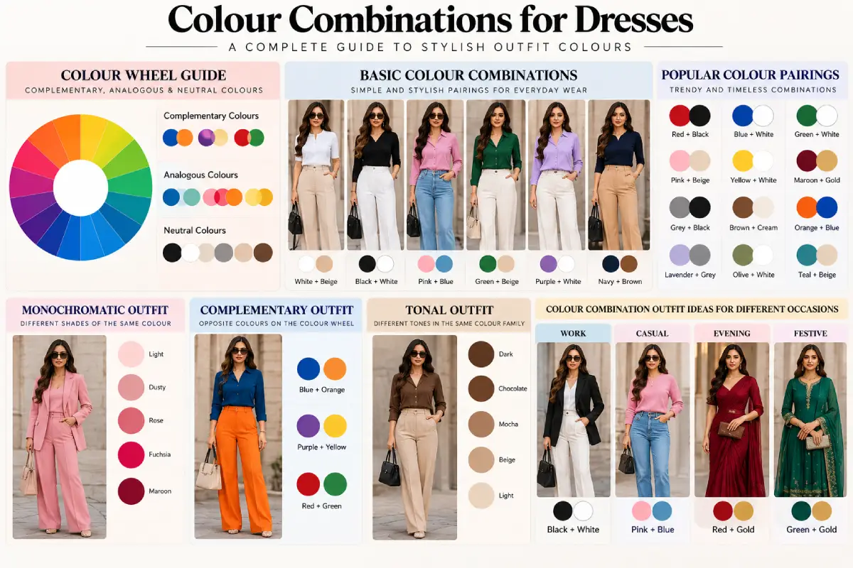
Colours positioned next to one another on the wheel (such as orange and yellow or blue and teal) appear muted and blended, with a low contrast like quality. Conversely, colours positioned opposite one another on the wheel (for example, blue and orange or purple and yellow) will produce an intense, high contrast appearance because <cite index=“25-1”>Combining hues from opposite sides of the wheel makes for a more jarring, high contrast effect. Sitting opposite to one another, or close together is more soothing and looks more single toned (like black and white) in comparison</cite>.
Neither option is “better” they just suit different moods:
-
Close-on-the-wheel pairings work well for everyday and office wear, where you want colour without visual noise.
- Opposite-on-the-wheel (complementary) colors are much more suitable when you want a dress or outfit to look utterly fabulous like when you got to a party, a special event, or on a photo.
A down-to-earth tip for wearing complementary colours without looking like fancy dress: one colour should take precedence and the other function solely as an addition. A blue dress accessorized with a small orange handbag or earrings is intentional; a blue dress with a large orange coat is often fighting for attention.
Pair Neutral Dress Colours with Layers and Accessories
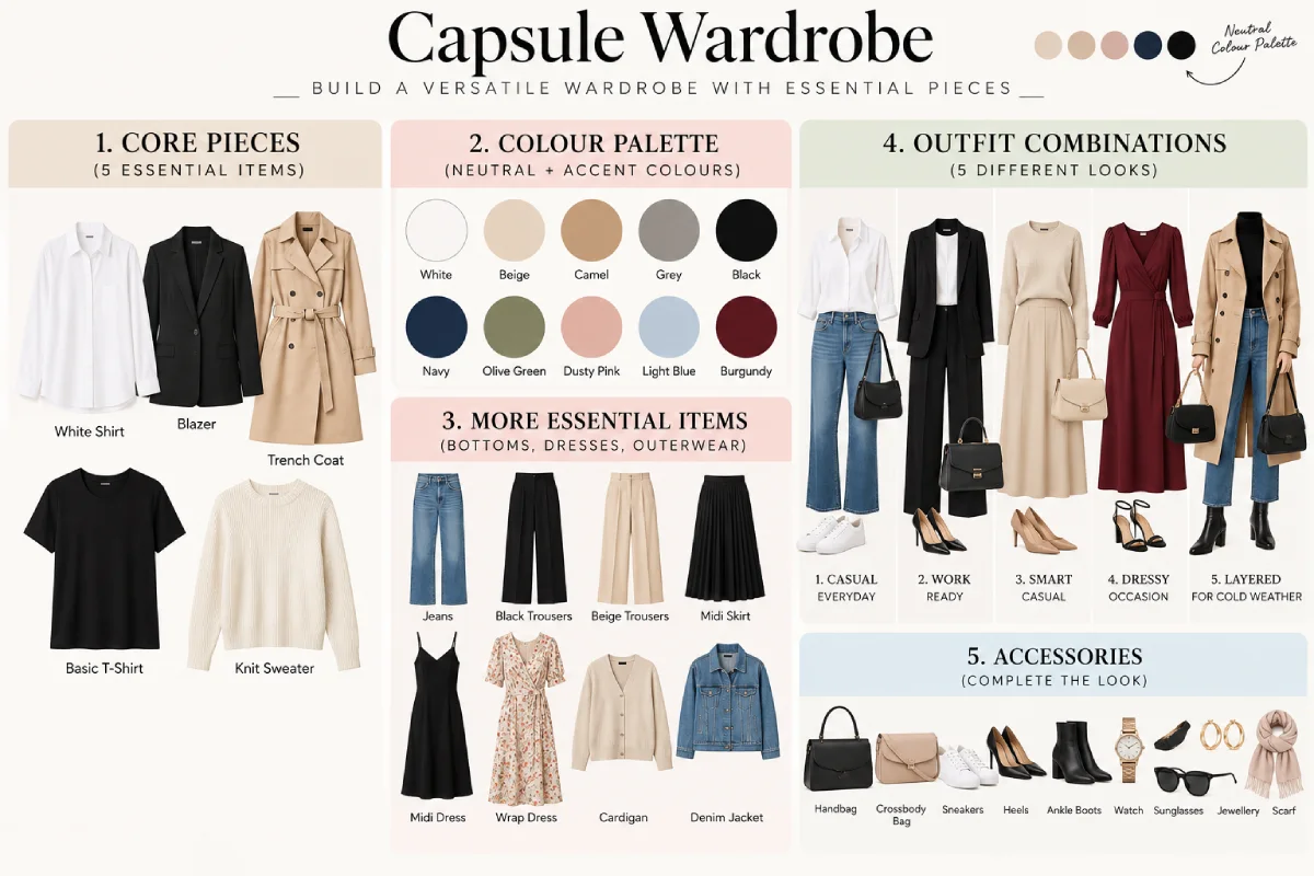
For an already strong colour, the easiest and safest combination is with a neutral; black, white, grey, beige, navy and camel are not competing with the dress- they are simply there.
This matters most for two situations:
- Bright (or saturated) dresses (e.g. red, cobalt, emerald) complemented by a neutral cardigan, blazer, bag or shoe to not split the focus of the bright dress into two equally bright colours.
-
Printed or patterned dresses, where a neutral layer avoids adding a second competing pattern or colour into an already busy look.
Boring is not the same as neutral. A lot is done by texture here, too: a chalky black blazer with an airy-silk dress reads quite differently than a satiny knit cardigan with the same dress, although the colour is the same. If a neutral-to-neutral dress pairing is the nucleus around which an outfit is to be built, one advice that might help when finishing the styling: warm neutrals (camel, beige, warm brown) tend to be most compatible with warm colours of a dress (red, orange, mustards), cool neutrals (grey, cold white, black) with cool colours (blue, teal, purple). This is not a teaching, really, but it sort of explains why still some perceived “defensive” neutral pairings look slightly off.
Try Monochromatic, Complementary and Tonal Looks
Beyond picking one accent colour, there are three broader looks worth knowing by name, because searching for outfit inspiration will use these terms constantly:
| Approach | What it means | Best suited for |
|---|---|---|
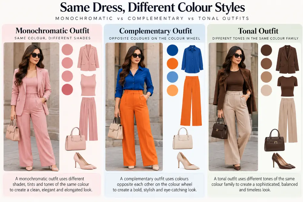
| Monochromatic | One colour family, varied in shade and texture (e.g., a blush dress with a dusty-rose bag and mauve shoes) | Elegant, elongating, low-effort-to-get-right looks; good for formal or polished settings |
| Complementary | Two colours from opposite sides of the colour wheel | Bold, statement looks; best for events where you want to stand out |
| Tonal | Similar undertone or “temperature” (all-warm or all-cool colours) without being the exact same hue | A middle ground — more visual interest than monochromatic, less contrast than complementary |
Monochromatic dressing is often the easiest starting point for anyone unsure about colour, because it removes the main risk (two colours clashing) entirely. The trick to making it look intentional rather than accidental is varying the shade and texture, not wearing the exact same colour in flat fabric head to toe.
Build Colour Combinations Around Prints
Because printed dresses have their own “colour statement”, they require a different treatment. The print is doing its job (a “colour statement”) for you.
A consistent color: take one color from the print (it doesn‘t need to be the main color) and play off that with a matching bag, shoes, cardigan anything that is the same shade. Helps tie the outfit together without bringing in a different color.
On more serious or multi-coloured prints, then a neutral pairing (see Section 2) is probably safer. By its very nature, a busy print is likely to turn the second (unrelated) colour into a distraction rather than enhancement. Reserve the ‘pick a colour out of the print’ trick to simpler designs with two or three distinguishable colours rather than a complex all-over pattern.
Dress Colour Pairing Examples for Different Occasions
Putting the approaches together against real scenarios:
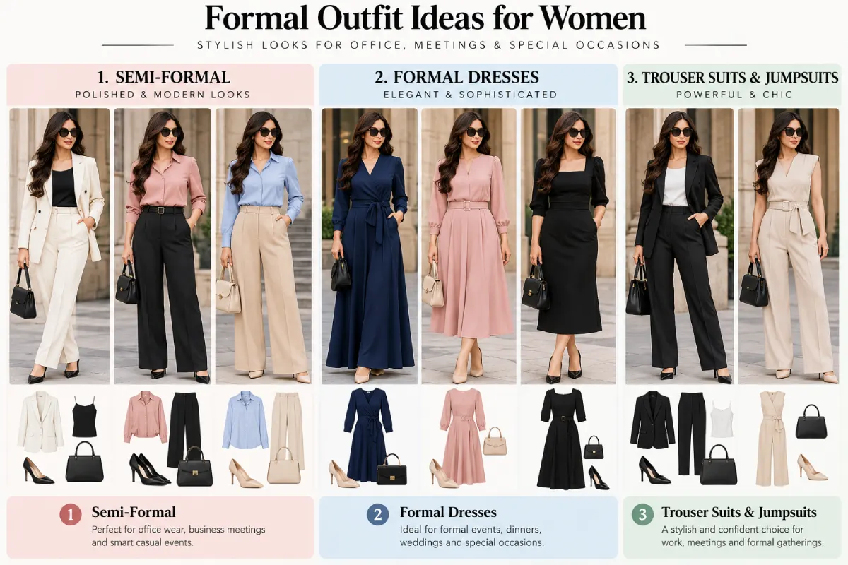
- Work/office: A navy or forest-green dress with black or camel accessories (neutral pairing) — professional, low-risk, easy to repeat.
- Casual daytime: A yellow or coral dress with white or light denim (tonal/neutral mix) — relaxed, warm-weather appropriate.
- Evening/event: A jewel-tone dress (emerald, sapphire, wine) with a single complementary-colour accent — one bold accessory rather than a second bold garment.
- Festive/wedding guest: A pastel or rich-colour dress in a monochromatic build — one colour family from dress to shoes to bag reads polished in photos, which matters more at these events than everyday wear.
- Printed dress, any occasion: Neutral shoes/bag as the default, with one print-matched accessory (like a clutch in the print’s accent colour) if you want a bit more cohesion.
None of these are fixed rules — they’re starting points that make the decision faster, especially on days when you don’t want to overthink it.
FAQs
What colours go best with a black dress?
Almost anything, which is why black is the most common “safe” dress colour. For a classic look, pair black with white or metallics (gold or silver). For a softer look, pair it with one muted colour like dusty pink or sage as a single accent through a bag or shoes, rather than a full second garment.
Is it okay to wear two bright colours together?
Yes, as long as one is dominant and the other serves a supportive role. Two equally saturated, equally size color patches will fight against one another; a single dominant color with a less dominant accent through jewellery, shoes, a bag will tend to look used by deliberate design rather than accident.
What is a monochromatic outfit, exactly?
A mono-colored outfit uses only 1 color family (say, all shades of blue from the dress to shoes to wallet) instead of several other individual colors. Using a variety of textures and shades will prevent the look from falling flat.
How do I match colours to my skin tone?
As a general starting point, warmer skin tones often suit warm colours (rust, mustard, warm red) especially well, while cooler skin tones often suit cool colours (jewel blues, true reds, purples) especially well. This is a helpful starting guideline rather than a strict rule — personal preference and the occasion matter too.
What colours should I avoid pairing together?
There’s no universally “wrong” pairing, but two competing saturated primary colours in equal amounts (for example, bright red next to bright green) is the combination most likely to look accidental rather than intentional, largely because neither colour gets to lead.
FINAL CONCLUSION
Colour combinations for dresses get easier once you stop treating every dress as a new puzzle and start recognising which of four approaches — neutral pairing, complementary contrast, monochromatic building, or print-based matching — fits the dress in front of you. Each approach solves a different problem: neutrals let a bold dress lead, complementary colours create intentional contrast, monochromatic builds are the safest route to a polished look, and print-based pairing keeps a patterned dress from competing with itself. Once the colour decision is settled, the rest of the outfit — proportion, accessories, and finishing touches — is covered in full in the Outfit Styling Guide, the hub this colour guide supports.